Styling: CSS variables
The general styles of Paella Player and its standard user interface components are defined in the paella-core library. They are designed in such a way that they can be customized mainly by modifying the values of a number of CSS variables. This makes it unnecessary to know the internal structure of the DOM tree.
In addition, the use of CSS variables to configure the appearance of the player makes it possible to make future changes to the DOM tree, while maintaining the compatibility of the modified CSS styles, as long as these changes are made only by modifying the CSS variables.
Player sizes
Section titled “Player sizes”Most sizes and margins can be controlled with CSS variables. To understand which variables to modify, the first thing to do is to understand the structure of the player containers. The player is divided into three main areas:
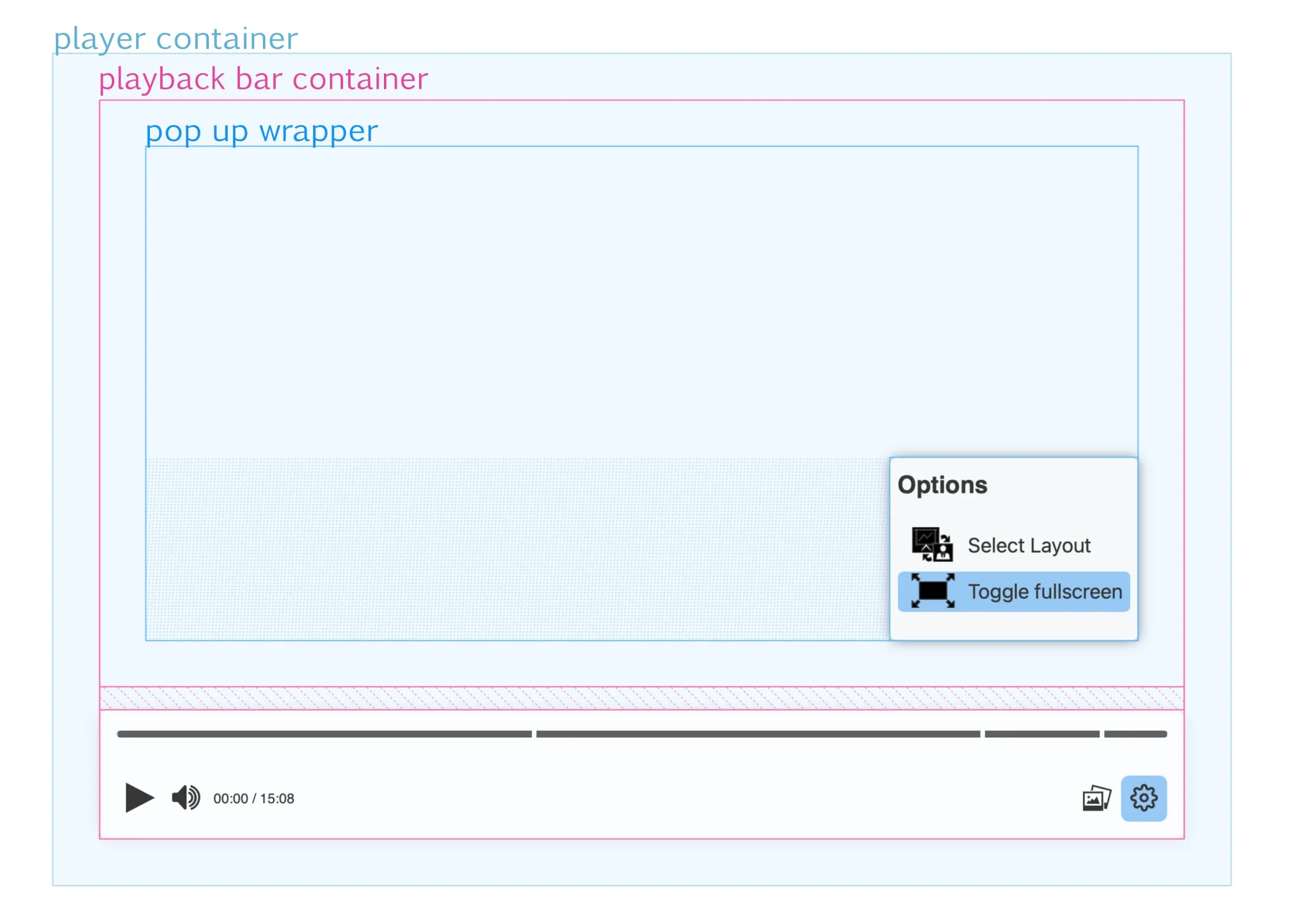
player container: is the DOM tree element where the player is placed, and therefore its size and position does not depend on Paella Player. The programmer is responsible for positioning and setting the size within the HTML document.playback bar container: the container that encompasses the playback bar and the pop-up display area, so it is divided into two parts vertically. The height of the lower part, which corresponds to the playback bar, depends on the final height of the playback bar, and this size in turn depends on the size of the elements that make up the playback bar.pop up wrapper: the pop-up container is placed inside the upper part of the playback bar container. In this area is where the pop ups are displayed, which can be aligned to the left, to the right or occupy the entire width of the container. In any case, the pop ups will always be displayed aligned to the bottom of the pop up wrapper container.
Note: The video can occupy the whole player container, so that the playback bar is placed over it, or it can be placed on the top of the playback bar, which would correspond to the top area of the playback bar container. This option is not controlled by CSS, but is configured in the player configuration file.
These are the CSS properties that control the sizes of the containers in the above figure:
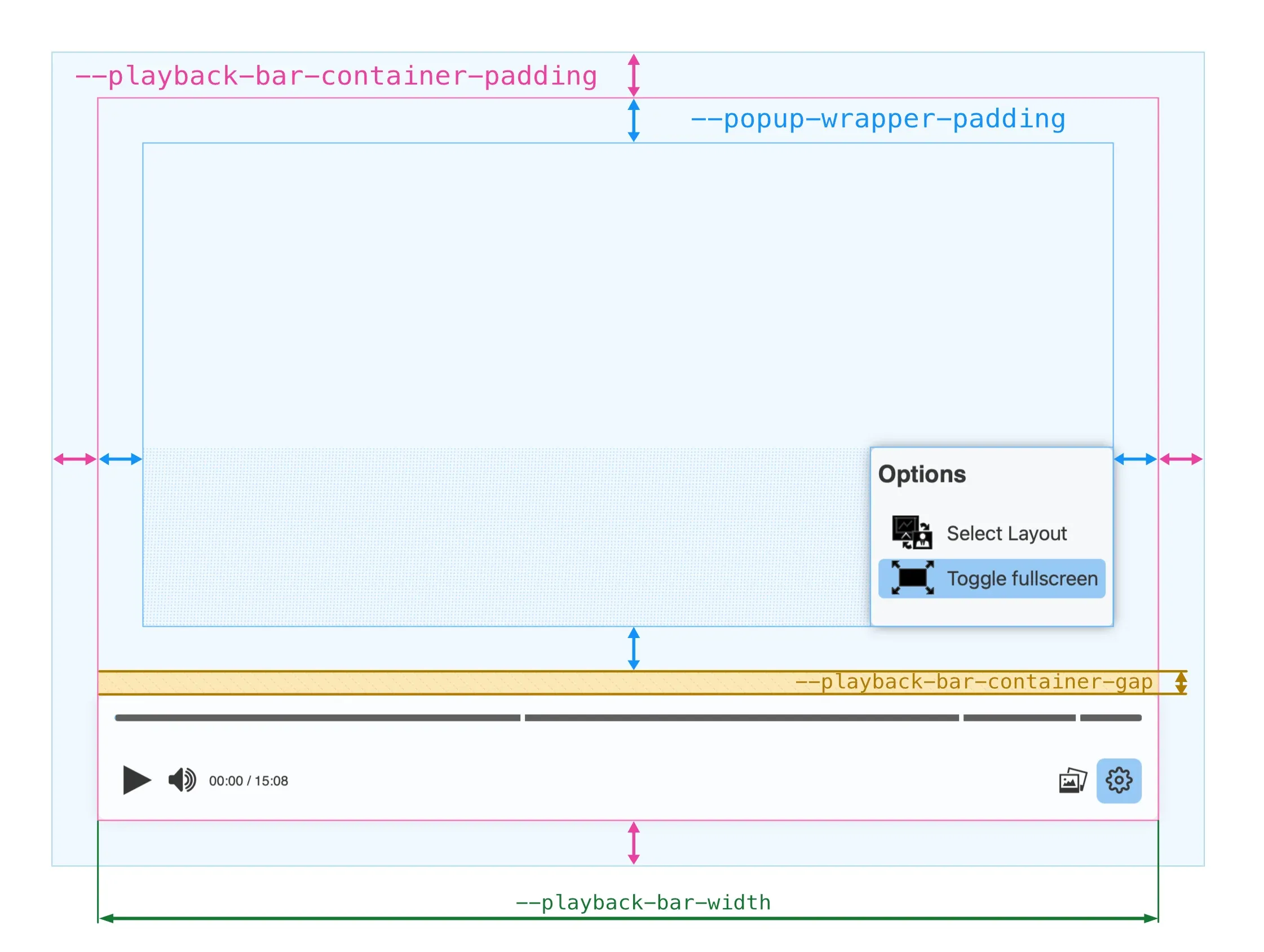
--playback-bar-container-paddingpaddingproperty of the video container, so it can be initialised with a general padding, a vertical and a horizontal padding or with a separate padding for each side.--popup-wrapper-padding--playback-bar-container-gapgapproperty of the playback bar container.--playback-bar-width
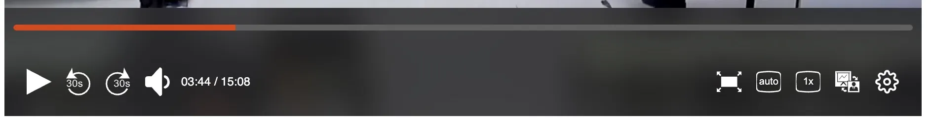
Playback bar
Section titled “Playback bar”The playback bar is the main user interface element of Paella Player. It is the area where the user interacts with the buttons, and where the player displays the progress of the video.
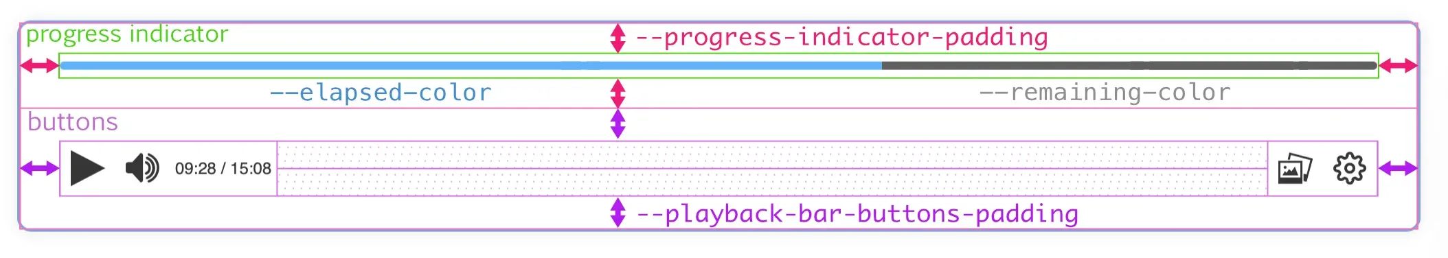
The playback bar is divided into two main areas: the progress indicator area and the buttons area.
We can control the padding of the buttons and the padding of the progress indicator with the following variables:
--progress-indicator-padding--playback-bar-buttons-padding
Both previous variables are used as the value of the padding property of the corresponding area, so we can specify a general padding, a vertical and a horizontal padding or a separate padding for each side.
In addition, the progress indicator is divided into two sections: the elapsed section and the remaining section. We can define the background color of each of these sections with the following variables:
--progress-indicator-completed-bg-color--progress-indicator-remaining-bg-color
Slide markers
Section titled “Slide markers”The progress bar can be displayed in two different ways depending on the characteristics of the video. If the video has slide markers, the progress bar is displayed as follows:
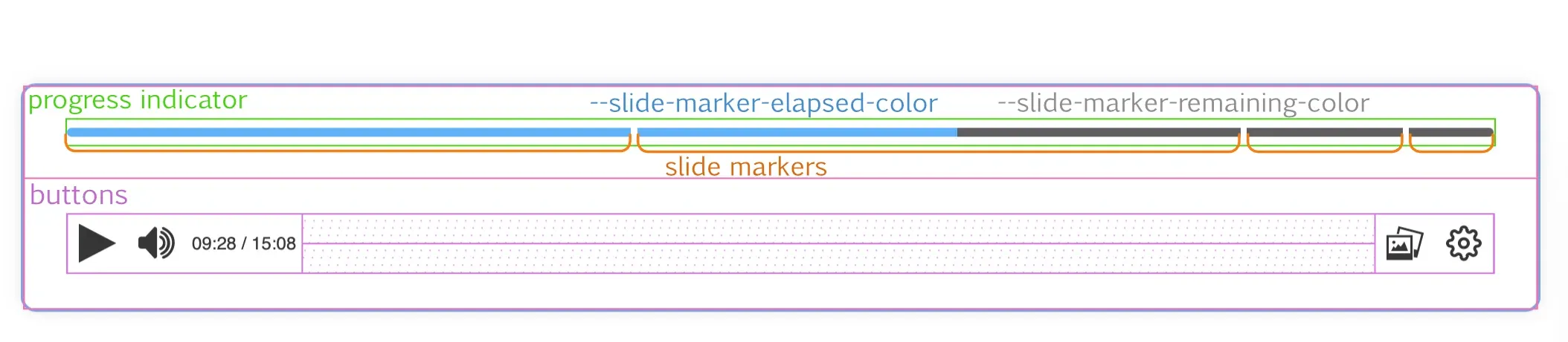
In this case, each independent marker will have elapsed and remaining sections, which will be displayed or not depending on the progress of the video. In this case we can control the background color of these sections with two different variables, in case we want to differentiate the background color of the elapsed and remaining sections from the slide markers and the playback bar without markers:
--slide-marker-elapsed-color--slide-marker-remaining-color
Note that a video will only display the playback bar in one of two ways, as whether or not a video has slide markers is a feature of the video, not the player or its state.
If you want to set the same elapsed and remaining color for both progress bar display modes, simply change the value of --progress-indicator-complete-bg-color and --progress-indicator-remaining-bg-color, since the --slide-marker-elapsed-color and --slide-marker-remaining-color variables are initialized by default with the value of the first two.
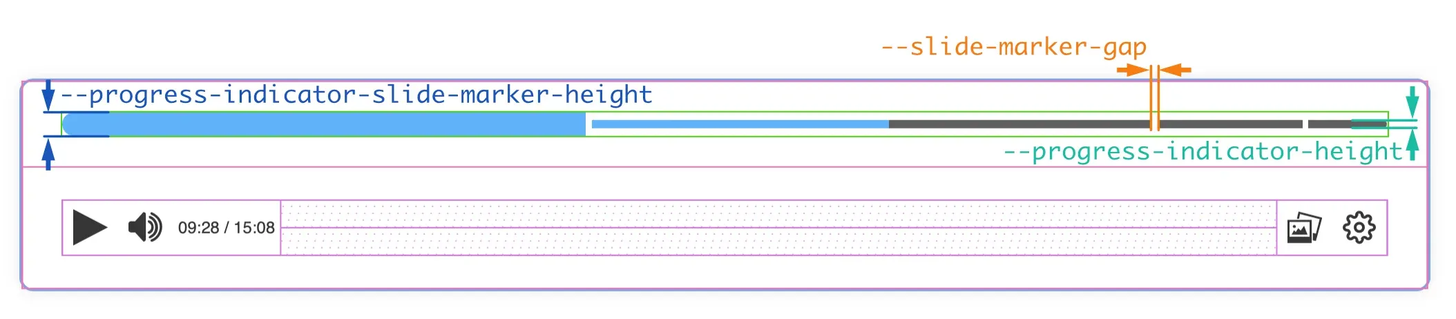
Progress indicator sizes
Section titled “Progress indicator sizes”In the progress indicator we can control three sizes:
--progress-indicator-height--progress-indicator-slide-marker-height--progress-indicator-height.--slide-marker-gap
Other playback bar sizes
Section titled “Other playback bar sizes”We can also control the size of the buttons in the playback bar, its icons, the font size and the border radius of the buttons and the playback bar itself.
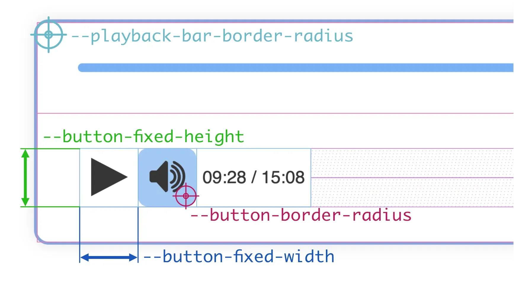
--playback-bar-border-radiusborder-radiusproperty of the playback bar, so you can set the same value for all corners or set a different value for each corner.--button-fixed-widthfixed.--button-fixed-heightfixedprefix indicates that this size is related with the--button-fixed-widthproperty, but the buttons can not have a non-fixed height.--button-fixed-size--button-fixed-width--button-fixed-height--button-border-radiusborder-radiusproperty of the buttons, so you can set the same value for all corners or set a different value for each corner. Note that, by default, the background color of the buttons is transparent, so the border radius will not be visible until you point the mouse cursor over the button.--button-icon-size--button-fixed-width, but you can set it to any value you want.
The drop-down menus in paella-core are containers that are displayed above the playback bar. They can be aligned to the left or to the right, or they can occupy the entire width of the playback bar. The position of the container we have seen before, we control it with the --popup-wrapper-padding and --playback-bar-container-gap properties. The rest of the measures that we can control are shown in the following figure:
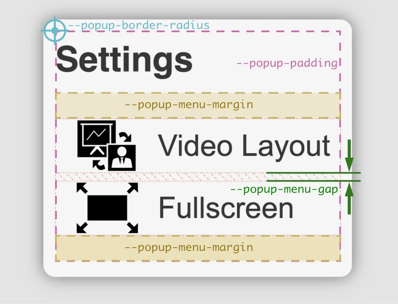
--popup-border-radiusborder-radiusproperty of the menu container. You can specify a value for each corner or a general value for all corners.--popup-paddingpaddingproperty of the menu container. You can specify a value for each side or a general value for all sides.--popup-menu-marginmarginproperty of the menu item container. We can specify a value for all sides, a vertical and a horizontal value, or a value for each side.--popup-menu-gapgapproperty for that container.
Other sizes that we can control are:
--popup-item-heightautovalue to make the height fit the menu content, or you can specify a fixed value. If the value is fixed, the menu text will be adjusted to the size of the item.--popup-item-border-radiusborder-radiusproperty of the menu items. You can specify a value for each corner or a general value for all corners.--popup-menu-item-icon-size
To modify the rest of the sizes of the fonts, see the next section.
The rest of the size properties of the menu items are extracted from the buttons (background colors for states, text and icon colors, icon sizes, etc).
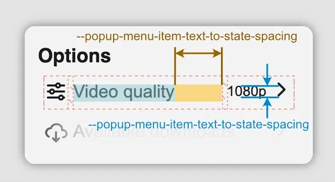
Menu items can also have a status. The status of a menu item consists of text and an icon. The status icon is also automatically used to indicate that the menu item is a submenu. Whan a menu item has a status, there are also the following variables to control the appearance of these elements:
--popup-menu-item-state-text-size--popup-menu-item-text-to-state-spacing
Font sizes
Section titled “Font sizes”The playback bar can hold three different font sizes. When a plugin needs to display a text, it can use one of these three sizes. For example, the time indicator next to the volume control is a non-interactive ButtonPlugin, with variable width, and it displays the time using the medim font size. The quality selector and the playback rate plugins are interactive ButtonPlugins, with fixed width, and they display the text using the small font size.
--small-text-size: is the small font size.--medium-text-size: is the medium font size.--large-text-size: is the large font size.
Note: The default values of the
--button-fixed-sizeand the--*-text-sizeare defined using text font relative sizes, but if you change the size of the buttons, you’ll probably need to change the font sizes as well.
The menus have two texts: on one side is the title of the menu, and on the other side are the texts of the menu items. We can control the size of these texts with the following variables:
--popup-title-font-size--popup-menu-item-font-size
Video canvas buttons
Section titled “Video canvas buttons”Video canvas buttons are those buttons that are displayed at the top of each of the video stream containers. These buttons can only be placed on top of the containers, so that they do not interfere with the playback bar. Each button decides whether it should be placed aligned to the left, centre or right of its container. All other properties are configurable.
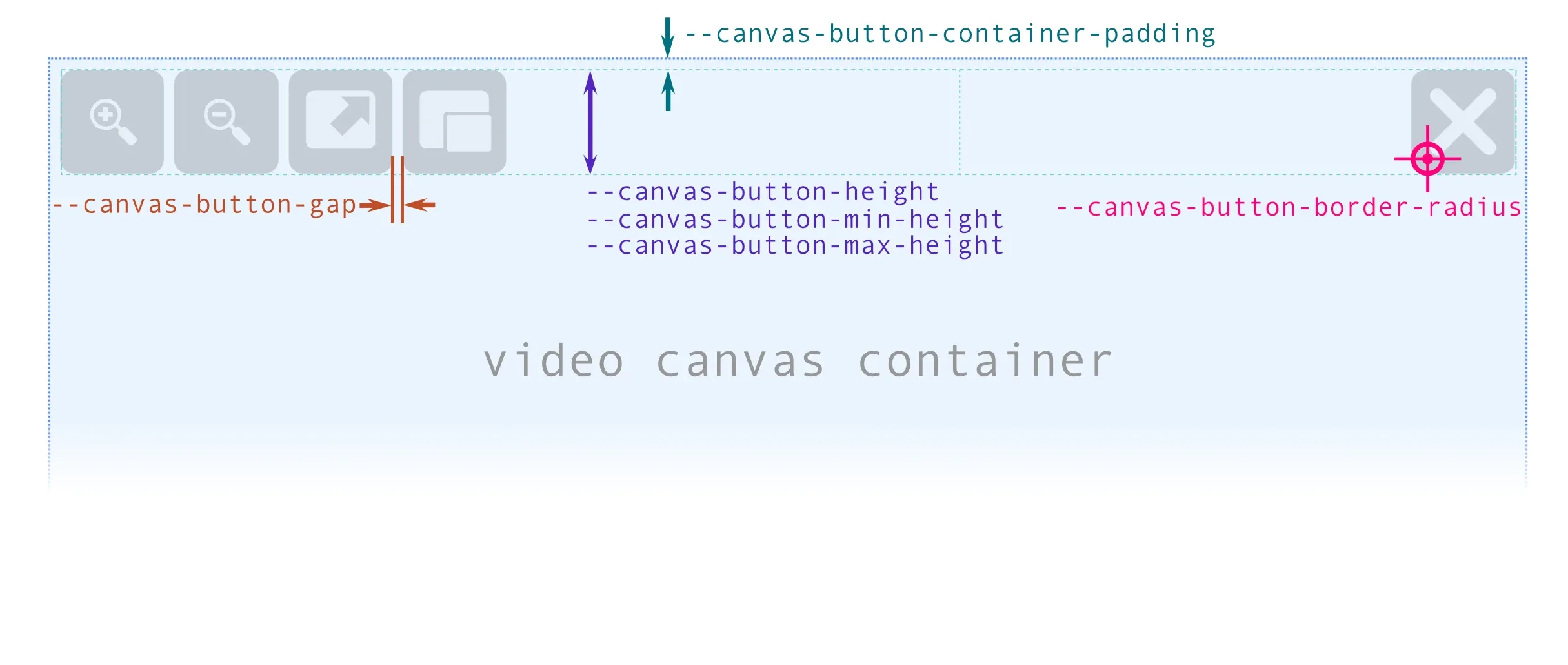
The video canvas button container is a flex container which in turn contains three other flex containers: one for left-aligned buttons, one for centre-aligned buttons and one for right-aligned buttons. This main container controls its padding via the --canvas-button-container-padding variable. To indicate the spacing between the buttons, the --canvas-button-gap variable is used as the value of the gap property of the three flex containers for each of the button groups.
Button size
Section titled “Button size”The height of the buttons is controlled indirectly, through the height of the main container. The buttons have a fixed height of 100% defined, and the following variables are used to control the size of the container:
--canvas-button-height: height of the button container. By default, a measurement relative to the height of the video canvas (15%) is used. A relative measurement is used because the size of the video canvas is highly variable, and this ensures that the size of the button adapts to the size of the canvas in an optimal way.--canvas-button-button-min-heightand--canvas-button-max-hegiht: These two variables allow us to improve the control we have over the maximum and minimum size of the buttons, allowing us to indicate fixed sizes that adapt to a good visualisation of the icons, and at the same time allowing the buttons not to occupy too much space on the screen when the video canvas is very large.
Button appearance
Section titled “Button appearance”--canvas-button-aspect-ratio: as we control the height of the buttons by the height of the container, to control the width we indirectly use theaspect-ratioproperty.--canvas-button-padding: is the padding of the buttons. It is used as the value of thepaddingproperty of the buttons, so you can set a general padding, a vertical and a horizontal padding or a separate padding for each side. It’s recommended to use a percentage value, so that the padding adapts to the size of the button.--canvas-button-border-radius: is the border radius of the buttons. It is used as the value of theborder-radiusproperty of the buttons, so you can set the same value for all corners or set a different value for each corner.--canvas-button-background: is the background color of the buttons. By default it uses the--main-bg-colorvariable, but through this variable we can specify a custom colour different from the colours of the playbar buttons. It is not possible to modify the background colour for thehoveroractivestate, as these colours are defined by the global highlight colour variables to preserve the visual style of the interface.
Opacity
Section titled “Opacity”The video canvas buttons have three states of opacity:
- Minimum opacity** (
--canvas-button-opacity-out): occurs when the user interface is visible, but the mouse cursor is not outside the container of the video canvas containing the button. - Normal opacity** (
--canvas-button-opacity): occurs when the mouse cursor is over the video canvas container containing the button, but is not over the button itself. - Maximum opacity** (
--canvas-button-opacity-hover): occurs when the mouse cursor is over the button.
Colors
Section titled “Colors”The colors of interface elements can be defined in a granular way (e.g. the background colour of a button) or in a global way. In the default paella-core styles there are a number of generic colors, which are then used as defaults in the other variables that control the colors in a granular way. Generally, it will be enough to modify the global colors, but if you need to modify a specific variable you can do that too.
Global colors
Section titled “Global colors”--main-fg-color: main foreground color.--main-bg-color: main background color. This color must have a certain contrast with the foreground color, so that the text is readable.--main-bg-color-hover: background color for thehoverstate. As with the previous color, this color must have a certain contrast with the foreground color, so that the text is readable.--secondary-bg-color: secondary background color. It should be a color similar to--main-bg-color, which should also have some contrast with the foreground color.--secondary-bg-color-hover: secondary background color for thehoverstate.--highlight-bg-color: highlight background color, for example, one selected option in a menu. This color should contrast with the main color, and should also stand out from the background color.--highlight-bg-color-hover: highlight background color for thehoverstate.--main-border-color: main border color used in some elements.--main-outline-color: main outline color for the input controls. This color is used in the input controls infocus-visiblestate.
Note about SVG code: In order for
paella-coreto control how SVG icon colors are displayed, internally the fill and stroke colors are specified in the styles. This will only work if the SVG code of the icons does not include the fill and stroke colors explicitly. Also, if the SVG icon is designed to display a fill color but not a stroke color, the root of the image must include thestroke:nonestyle attribute. The same applies if the icon is not intended to display a background color, in which case the image root must include thefill:nonestyle attribute.
Specific colors
Section titled “Specific colors”--button-color: It is the foreground color of the buttons. It is used in the icon and in the button text. By default this variable is initialized with--main-fg-color.--icon-color: This is the color of the button icon. By default it is--button-color.--button-background: This is the background color of the buttons. By default it is transparent, so that it does not interfere with the background color of your container.--button-background-hover: Is the background color of the buttons in thehoverstate. By default it is--highlight-bg-color.--button-background-active: Is the background color of the buttons in theactivestate. By default it is--highlight-bg-color-hover.
Gradients
Section titled “Gradients”There are two color gradients that are used in the playback bar area, and they correspond to the gradient for the normal state and the hover state:
--playback-bar-gradient: is the gradient used in the playback bar area.--playback-bar-gradient-hover: is the gradient used in the playback bar area in thehoverstate.
Timeline handler
Section titled “Timeline handler”The timeline handler is the element that allows you to control the progress of the video. It is a draggable element that can be moved along the progress bar. The handler has three states: normal, hover and active. The hover state is when the mouse cursor is over the handler, and the active state is when the mouse button is pressed and the handler is being dragged.
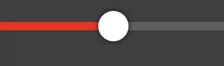
It is possible to control a lot of properties of the handler with CSS variables:
--handler-size: Is the size of the handler.--handler-height: Is the height of the handler. By default it is initialized with the value of--handler-size.--handler-width: Is the witdth of the handler. By default it is initialized with the value of--handler-size.--handler-transition-time: This is the time interval it will take to modify the handler properties between one state and another (normal, hover or active).
To control the appearance of the handler in the different states (normal, hover and active) we have the following variables, which by adding the suffix -hover or -active are applied to the corresponding states:
--handler-scale: To control the scale of the handler, the propertytransform: scale(S)is used. This variable controls the value of theSparameter. The variables for the hover and normal states are--handler-scale-hoverand--handler-scale-active.--handler-color: Is the color of the handler. The variables for the hover and normal states are:--handler-color-activeand--handler-color-hover.--handler-shadow: Is the shadow of the handler. The variables for the hover and normal states are:--handler-shadow-hoverand--handler-shadow-active.--handler-radius: This is the value of thebox-shadowproperty of the handler. The variables for the hover and normal states are:--handler-radius-hoverand--handler-radius-active.--handler-opacity: This is the opacity of the handler. The variables for the hover and normal states are:--handler-opacity-hoverand--handler-opacity-active.--handler-border: This is the border of the handler. The variables for the hover and normal states are:--handler-border-hoverand--handler-border-active.
Effects
Section titled “Effects”Backdrop filter
Section titled “Backdrop filter”The pop up containers and the playback bar include a background effect for the normal and hover states. By default a blur is used, which is more intense in the hover state than in the normal state:
--playback-bar-backdrop-filter: Background filter of the playback bar area.--playback-bar-backdrop-filter-hover: Background filter of the playback bar area in thehoverstate.--popup-backdrop-filter: Background filter of the pop up windows.--popup-backdrop-filter-hover: Background filter of the pop up windows in thehoverstate.
Shadows
Section titled “Shadows”There are several elements that can have a shadow effect. In the default paella-core styles, some of these elements do not have the effect applied, but can be added via their corresponding CSS variable:
--popup-box-shadow: It is the value of thebox-shadowproperty of pop up windows (e.g. menus).--playback-bar-shadow: It is the value of thebox-shadowproperty of the playback bar area.--handler-shadow: It is the value of thebox-shadowproperty for the progress indicator controller.--handler-shadow-hover: It is the value of thebox-shadowproperty for the progress indicator controller in thehoverstate.--handler-shadow-active: It is the value of thebox-shadowproperty for the progress indicator controller in theactivestate.--timeline-preview-box-shadow: It is the value of thebox-shadowproperty for the timeline preview area. This area is the container that displays the preview image and the time instant when we hover the mouse cursor over the timeline.
Video container messages
Section titled “Video container messages”These variables control the appearance of messages displayed through the video message API:
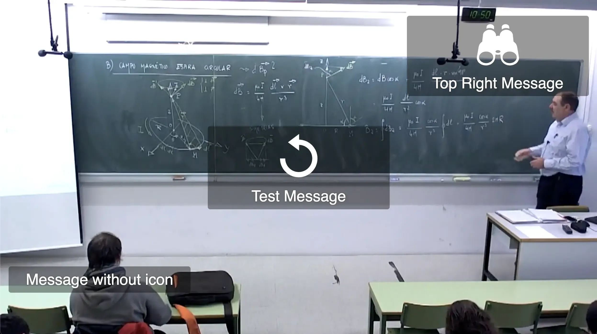
Messages about the video container can be displayed in nine different positions, and the base style used for this is a grid. Within the grid, we can customise the messages: background colour, foreground colour and overall appearance of the message boxes.
In addition, messages are displayed in three different sizes, depending on the current size of the video container:
- small (
sm): up to700pxwide. - medium (
md): from701pxto1300pxwide. - large (
ld): from1301pxwide.
The CSS variables to control the general appearance of the messages are:
--video-container-message-bkg: background color of the message box.--video-container-message-color: foreground color of the message box, used in texts and icons.--video-container-message-padding: padding of the message box.--video-container-message-border-radius: border radius of the message box.
To control the sizes of the message box icon and text, the player follows two different approaches. For the text, we can control the font size for each of the three sizes with the following variables:
--video-container-message-font-size-sm--video-container-message-font-size-md--video-container-message-font-size-lg
For the icons, we can specify a general width for the icon using an absolute value, and then we can control the maximum width of the icon for each of the three sizes with the following variables:
--video-container-message-icon-width: the CSS variables for the video container message icon size depends on whether the value of this variable is defined in relative units.--video-container-message-icon-max-width-sm--video-container-message-icon-max-width-md--video-container-message-icon-max-width-lg
About SVG icons
Section titled “About SVG icons”Paella Player loads the SVG icons as text strings to insert them directly into the DOM tree. This allows us to control the color of the icons using CSS variables, and also to apply styles to the icons.
For this system to work correctly, the SVG code for the icons must not force the fill and stroke colours. A de facto standard on the web is for icons to use the fill and stroke attributes with the value currentColor, so that the colour of the icon matches the colour of the text. If the icon does not use these attributes, then the colour of the icon cannot be modified with CSS.
Let’s look at three examples below.
Example 1: Stroke based icon
Section titled “Example 1: Stroke based icon”If we have an SVG icon that uses only paths, we can include the following attributes in the root of the SVG:
<svg xmlns="http://www.w3.org/2000/svg" width="24" height="24" viewBox="0 0 24 24" stroke="currentColor" fill="none"> <path d="..."></path> <path d="..."></path></svg>Example 2: Fill based icon
Section titled “Example 2: Fill based icon”If we have an SVG icon that uses only fills, we can include the following attributes in the root of the SVG:
<svg xmlns="http://www.w3.org/2000/svg" width="24" height="24" viewBox="0 0 24 24" stroke="none" fill="currentColor"> <path d="..."></path> <path d="..."></path></svg>Example 3: Some elements with fill and others with stroke
Section titled “Example 3: Some elements with fill and others with stroke”If the SVG icon uses both fills and strokes in different elements, we can include a general rule in the root of the SVG, and then specify the fill and stroke for each element:
<svg xmlns="http://www.w3.org/2000/svg" width="24" height="24" viewBox="0 0 24 24" stroke="currentColor" fill="currentColor"> <path d="..." stroke="none"></path> <path d="..." fill="none"></path></svg>All CSS variables
Section titled “All CSS variables”General variables
Section titled “General variables”--main-fg-color--main-bg-color--main-bg-color-hover--secondary-bg-color--secondary-bg-color-hover--highlight-bg-color--highlight-bg-color-hover--main-border-color--main-outline-color--button-color--icon-color--player-font-family
Buttons
Section titled “Buttons”--button-fixed-size--button-fixed-width--button-fixed-height--button-border-radius--button-icon-size--button-background--button-background-hover--button-background-active
Video canvas buttons
Section titled “Video canvas buttons”--canvas-button-height: Fixed height of the buttons container.It is advisable to use percentage measurements, and to control the maximum and minimum button size with the following two variables.--canvas-button-min-height: Minimum height of the buttons container. It isn’t recommended to use a value lower than 28px.--canvas-button-max-height: Maximum height of the buttons container.--canvas-button-aspect-ratio: Aspect ratio of the buttons container.--canvas-button-gap: Gap between buttons.--canvas-button-padding: Padding of a button.It is recommended to use percentage measurements, as the size of the button can be variable..--canvas-button-border-radiusBorder radius of a button.--canvas-button-opacity: Opacity of a button when the mouse pointer is over the video canvas.--canvas-button-opacity-hover: Opacity of a button when the mouse pointer is over the button.--canvas-button-opacity-out: Opacity of a button when the mouse pointer is not over the video canvas.--canvas-button-border: Border of a button.--canvas-button-background: background of a button.
--progress-indicator-font-size--small-text-size--medium-text-size--large-text-size
Playback bar
Section titled “Playback bar”--playback-bar-buttons-padding--playback-bar-gradient--playback-bar-gradient-hover--playback-bar-backdrop-filter--playback-bar-backdrop-filter-hover--playback-bar-width--playback-bar-container-padding--playback-bar-container-gap--playback-bar-border-radius--playback-bar-border-color--playback-bar-border-style--playback-bar-border-width--playback-bar-shadow--progress-indicator-padding--progress-indicator-elapsed-color--progress-indicator-remaining-color--progress-indicator-height--progress-indicator-slide-marker-height--progress-bar-radius
Timeline handler
Section titled “Timeline handler”--handler-size--handler-height--handler-width--handler-scale--handler-color--handler-shadow--handler-radius--handler-opacity--handler-border--handler-transition-time--handler-scale-hover--handler-color-hover--handler-shadow-hover--handler-radius-hover--handler-opacity-hover--handler-border-hover--handler-scale-active--handler-shadow-active--handler-color-active--handler-radius-active--handler-opacity-active--handler-border-active
Timelilne colors
Section titled “Timelilne colors”--elapsed-color--remaining-color--slide-marker-elapsed-color--slide-marker-remaining-color--slide-marker-gap:
Timeline sizes
Section titled “Timeline sizes”--timeline-preview-gap--timeline-preview-border-radius--timeline-preview-box-shadow--timeline-preview-padding--timeline-preview-background--timeline-preview-color--timeline-preview-max-image-block-size
Video container
Section titled “Video container”--video-container-padding--video-container-gap--video-container-background-color--base-video-rect-background-color
Video container messages
Section titled “Video container messages”--video-container-message-bkg--video-container-message-color--video-container-message-padding--video-container-message-border-radius--video-container-message-icon-width--video-container-message-icon-max-width-sm--video-container-message-icon-max-width-md--video-container-message-icon-max-width-lg--video-container-message-font-size-sm--video-container-message-font-size-md--video-container-message-font-size-lg
Pop up/Menus
Section titled “Pop up/Menus”--popup-wrapper-padding--popup-backdrop-filter--popup-backdrop-filter-hover--popup-border-radius--popup-box-shadow--popup-padding--popup-menu-margin--popup-menu-gap--popup-menu-item-height--popup-menu-item-font-size--popup-menu-item-border-radius--popup-title-font-size
Examples
Section titled “Examples”Floating playback bar with rounded borders:
Section titled “Floating playback bar with rounded borders:”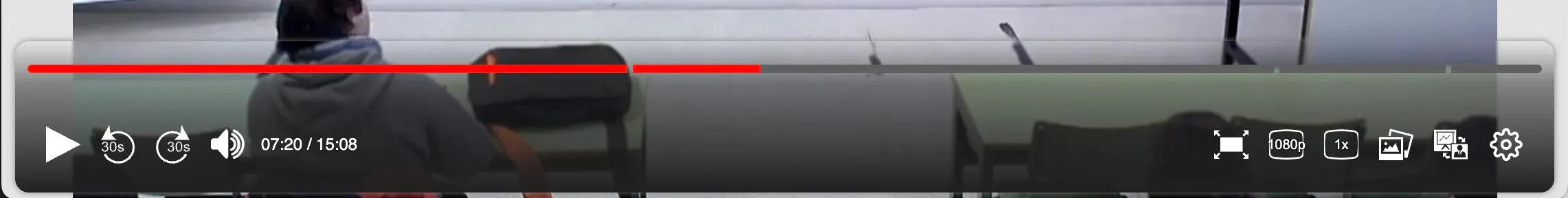
:root { --playback-bar-width: calc(100% - 2 * var(--playback-bar-container-padding)); --playback-bar-radius: 10px; --playback-bar-container-padding: 5px; --playback-bar-border-color: var(--main-border-color); --playback-bar-border-style: solid; --playback-bar-border-width: 0; --playback-bar-shadow: 0 0 5px 0 var(--main-border-color);}Black over white playback bar
Section titled “Black over white playback bar”
:root {    --highlight-bg-color: #61b2f9;    --highlight-bg-color-hover: #97c9f5;    --main-fg-color: rgb(54, 54, 54);    --main-bg-color: rgba(170, 170, 170, 0.923);    --main-bg-color: rgba(248, 248, 248, 0.78);    --secondary-bg-color: rgb(241, 241, 241);    --secodnary-bg-color-highlight: white;
    --playback-bar-gradient: linear-gradient(0deg, rgb(255 255 255 / 70%) 0%, rgb(255 255 255 / 50%) 60%, rgb(255 255 255 / 0%) 100%);    --playback-bar-gradient-hover: linear-gradient(0deg, rgb(255 255 255 / 80%) 0%, rgb(255 255 255 / 80%) 0%);    --playback-bar-buttons-padding: 15px 15px;}
Control the visibility of the timeline handler, depending on its state:
Section titled “Control the visibility of the timeline handler, depending on its state:”:root { /* Only visible in hover and active states */ --handler-opacity: 0; --handler-opacity-hover: 1; --handler-opacity-active: 1;}Modify the properties of one specific button
Section titled “Modify the properties of one specific button”It is also possible to specify specific colors for certain ButtonPlugin plugins (or their derivatives). Plugins of type ButtonPlugin initialise the name attribute of the button with the plugin identifier:
<button type="button" name="es.upv.paella.playPauseButton" class="fixed-width" aria-label="play" title="play"> ...</button>Therefore, you can specify the properties for a specific button using the following selectors:
.playback-bar ul>li>button[name="es.upv.paella.playPauseButton"] {    color: var(--highlight-bg-color);    background-color: var(--main-fg-color);
    & svg {        fill: white;        stroke: white;    }}
.playback-bar ul>li>button[name="es.upv.paella.playPauseButton"]:hover {    background-color: var(--highlight-bg-color);}
.playback-bar ul>li>button[name="es.upv.paella.playPauseButton"]:active {    background-color: var(--highlight-bg-color-hover);}
Note that when specifying properties for a specific button, you cannot simply modify the values of CSS variables. In this case you will have to directly change the properties you want to modify. The properties that affect the colour of the buttons are the ones you saw in the example above: color and background-color on the button, and fill and stroke on the SVG it contains.For these changes to be reflected in the icon, the SVG code for the button must be prepared for this. For example, if the internal elements of the SVG icon have inline properties for the fill colour or background, they cannot be modified from the CSS code.